
Building an identity from first principles.
A newly formed technical services company, entering the market without an existing visual foundation.
The name was set.
Everything else needed to be defined.
Rather than aiming for expression, the objective was clarity — a brand that could be recognised instantly, applied easily, and remain functional in daily use.
The identity was developed from the ground up.
Logo, typography, colour system, and application rules were designed as a coherent whole, with emphasis on legibility and durability rather than decoration.
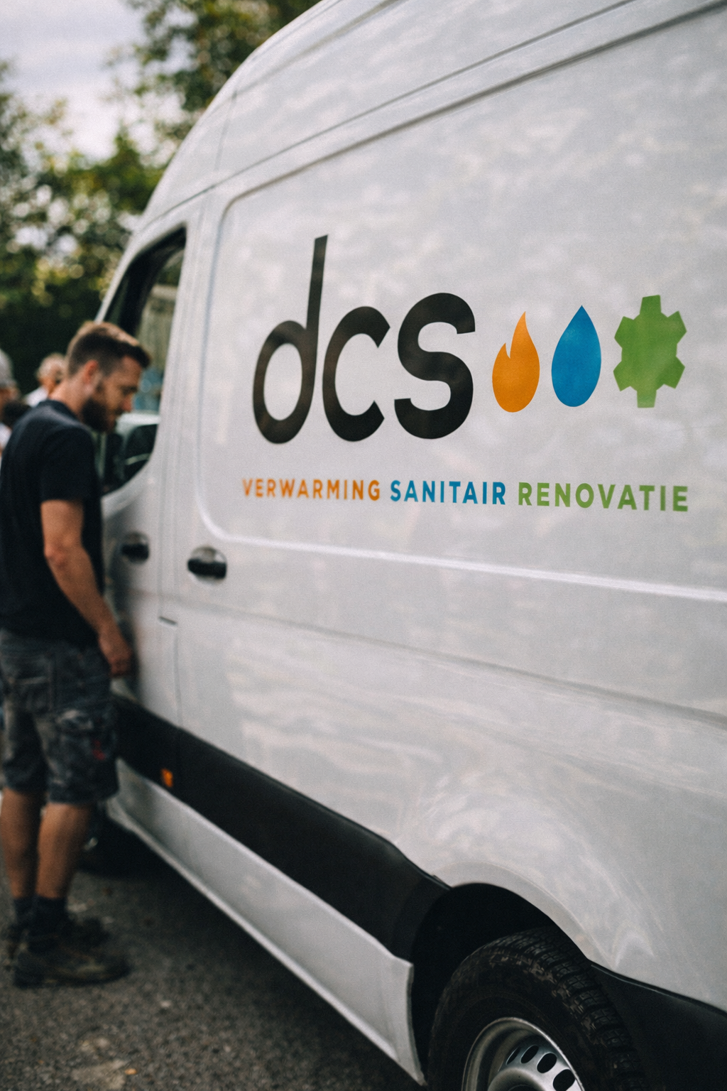
In a service-oriented context, most brand encounters happen in motion — on vehicles, uniforms, and site equipment. Visibility and recognition mattered more than nuance.
Every element was therefore tested for practical use:
clear at distance, reproducible at scale, and robust across materials.
Simple. Direct. Reliable.
The result is an identity that supports the work without drawing attention to itself — present where needed, invisible where not.
Scope of involvement
-
Development of logo, typography, colour system, and visual language.
-
Definition of clear usage rules across print, digital, and physical materials.
-
Design for vans and field equipment, optimised for legibility and recognition at distance.